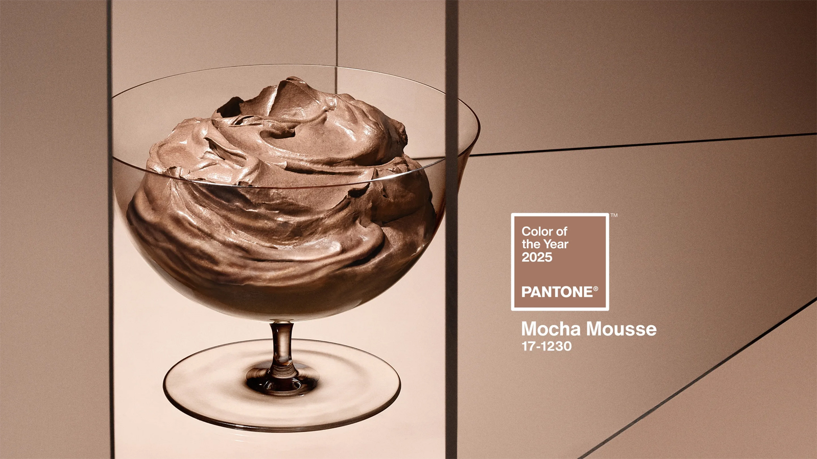
‘A warm shade of brown imbued with an innate richness that nourishes with its suggestion of the delicious quality of cocoa, chocolate and coffee, appealing to our desire for comfort’. This is how the Pantone Colour Institute describes Mocha Mousse, Colour of the Year 2025.
The US company, creator of the most accredited international colour identification system, started this tradition in 2000, which each year indicates to designers, architects, stylists and marketers in every sector, the Colour of the Year, a colour that ‘captures the global spirit of the times’.
‘Underpinned by our desire for everyday pleasures, Mocha Mousse expresses a level of thoughtful indulgence,’ said Leatrice Eiseman, Executive Director of the Pantone Color Institute. “Sophisticated and lush, yet an unpretentious classic, it extends our perception of browns from being humble and grounded to embracing aspiration and luxury. Infused with subtle elegance and earthy sophistication, Mocha Mousse presents a touch of understated, subtle glamour”.
From phones to perfumes
Like every year, the declinations of colour in objects and products of all kinds quickly multiplied.
Motorola presented its Edge 50 Neo in the shade Mocha Mousse, with a vegan leather finish created from organic materials and coffee grounds. And in the colour of the year, cashmere garments, earphones, room fragrance and make-up packs were made. Even Post-it made an edition of its self-adhesive pad of sheets in this soft brown shade.
A new palette for the home

But, as well as in fashion, it is in interior design and architecture that Mocha Mousse can express its full potential, transforming an environment, making it more welcoming or refined, simpler or more modern through wall paint and upholstery, furniture and accessories, curtains and fabrics.
Used alone or as a chromatic base to enhance other colours and materials, Mocha Mousse can express very different styles, feelings and inspirations.
With its open references to the natural world, it immediately refers to the ideals of sustainability and respect for the environment. Walls painted in Mocha Mousse juxtaposed with parquet or stone floors and tones such as beige, terracotta and sand, allow for a natural and organic style that conveys feelings of warmth and tranquillity.
One of the virtues of this colour is its ability to transform itself depending on the materials and hues with which it is combined. Next to cool tones such as greyish blue, sage green or pearl grey, it creates a modern atmosphere, while with bright colours such as mustard, coral or turquoise it creates unusual and energetic contrasts. As for metallic tones, gold, bronze and copper enhance the sophistication, while steel gives an immediate contemporary image.
To every space its own Mocha Mousse

Mocha Mousse contributes to creating a warm and cosy atmosphere: simply use it for decorative details such as cushions or carpets to complement sofas and furniture in neutral tones. An entire wall painted or upholstered in this colour not only defines the space but also gives the whole room a soft and refined touch.
Such a relaxing colour is naturally also suitable for the bedroom, where it can also be used for bed linen, making it more comfortable, or for accessories such as lamps and carpets. To further enhance the atmosphere, it is advisable to choose lighting with a warm colour temperature.
In the bathroom, interesting proposals can be explored for wall and floor coverings, combining Mocha Mousse with white and light grey, and for sanitary ware, such as freestanding bathtubs.
Among the virtues of Mocha Mousse also seems to be its ability to encourage concentration: a home office can certainly benefit from it, whether one uses it to paint a wall or chooses furniture or accessories in this colour. In this case, the light should be cooler to ensure greater functionality, which will however be mitigated by the softness of the colour.